When we started iMocha, we focused on one thing—digitizing interviews.
But for a while now, we’ve slowly moved beyond the realm of interviews, which was what we started with.
We needed to tell a larger story.
As the world’s largest skills assessment API platform, we have been helping organizations digitize, upskill, reskill, and so much more. We’ve seen immeasurable growth.
Yet, our brand didn’t suggest that. We had to rebrand ourselves.
A number of questions came to our mind: Would this be good enough? Would this speak to our customer base?
But we had a vision in mind, our North Star so to speak—hiring had to be made efficient. And we wanted to be the ones to do it.
This vision worked itself into our stories, our branding, and our positioning.
The Name
We started where all things usually start—the name. We all agreed that the name Interview Mocha no longer represented our evolving product.
That’s why we’re dropping the Interview and keeping the Mocha. But we are a little attached to the ‘i’ though, and we’re carrying it forward on our new adventure.
We are now iMocha, keeping i as a reminder of what we used to be; as a signal of what we are — innovative; and as a promise of what we’ll be — iconic.
(we’ve copied this verbatim from our story)
We’ve come to this name not just because we like alliterations (we do, but that’s a different story), but because we really do believe in innovation. And as our co-founder and CEO, Amit Mishra, says “If we innovate enough, we’d be iconic.”
With all the effort we’re putting in, we’ll soon be.
Our Visual Identity
With our name changing, our visual identity had to catch up with the rebranding. As much as we liked our logo, it had to go. Our rebranding and vision alignment called for a more expressive logo. The previous logo of imocha was simple and represented the youthful energy that we started this venture with. So, we’ve retained that energy, albeit in a more obvious way.

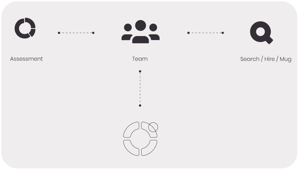
Nothing says energy like a cup of coffee does, and our new logo retains the 'coffee mug' element of our previous logo. The cup of coffee denotes a new start and is also the main essence of the brand. The new logo is reimagined to visually represent the product functionality—assessment. This is done through a pie chart which doubles up as the top view of a coffee mug. The idea was to encapsulate both the metaphoric and actual intent of the brand 'iMocha'.

Our Visual Cues
Colours and shapes have a way of conveying the essence of an entity at first glance. We’d worked on our shapes. Now all that was left was to give it some colour.
We wanted our brand colours to represent the story we were trying to share with the world. We chose our main brand colour to be a warm coral orange, which is bright, energetic, and fresh—just like a cup of coffee (that’s the kind of coffee we like). We want to stand out from the crowd through the vibrancy and delight that our visuals will elicit.
Our Illustrations
Illustration has proven to be an excellent medium to flush out concepts that are otherwise hard to convey through other methods. In our case, we used illustration as an opportunity to showcase our dedication towards diversity and being a people-first product.

The style, much like the editorial of a magazine or a newspaper, is clean and minimal. This helps us focus on what's most important to the brand: the people who make our product and use it.
This is how we’ll present ourselves to the world. This is how we’ll announce ourselves to the people who make us who we are.
Perhaps a video might be more revealing of what we are now:
We innovate, innovate, innovate; and our new brand can attest to that. We hope that our brand is represented as a unique, warm, and people-first entity for our users to engage with and advocate.

