Last year, we rebranded us from Interview Mocha to iMocha, and with that we changed the way we look, the way we interact, and now it is time that change reflects our UI, too.
It is for this reason we've created a new Design Language for iMocha, and this is a quick explainer on what it is exactly and, most importantly, what it means for you.
Design language, as Nate Baldwin aptly puts it, is the "overall visual design of a digital product." But it is much more than that: it is about ensuring visual consistency, reducing visual cognitive load on the user, and creating a unified method to communicate with the users. And we wanted to give you just that.
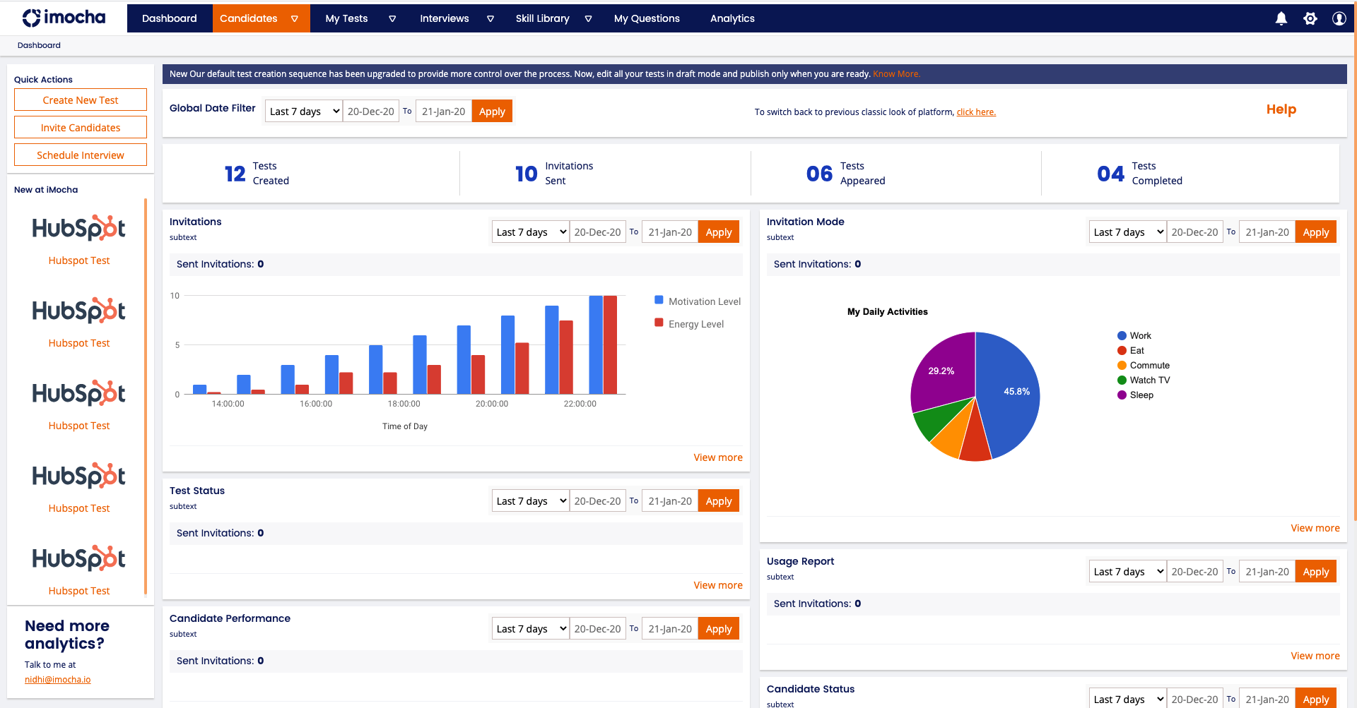
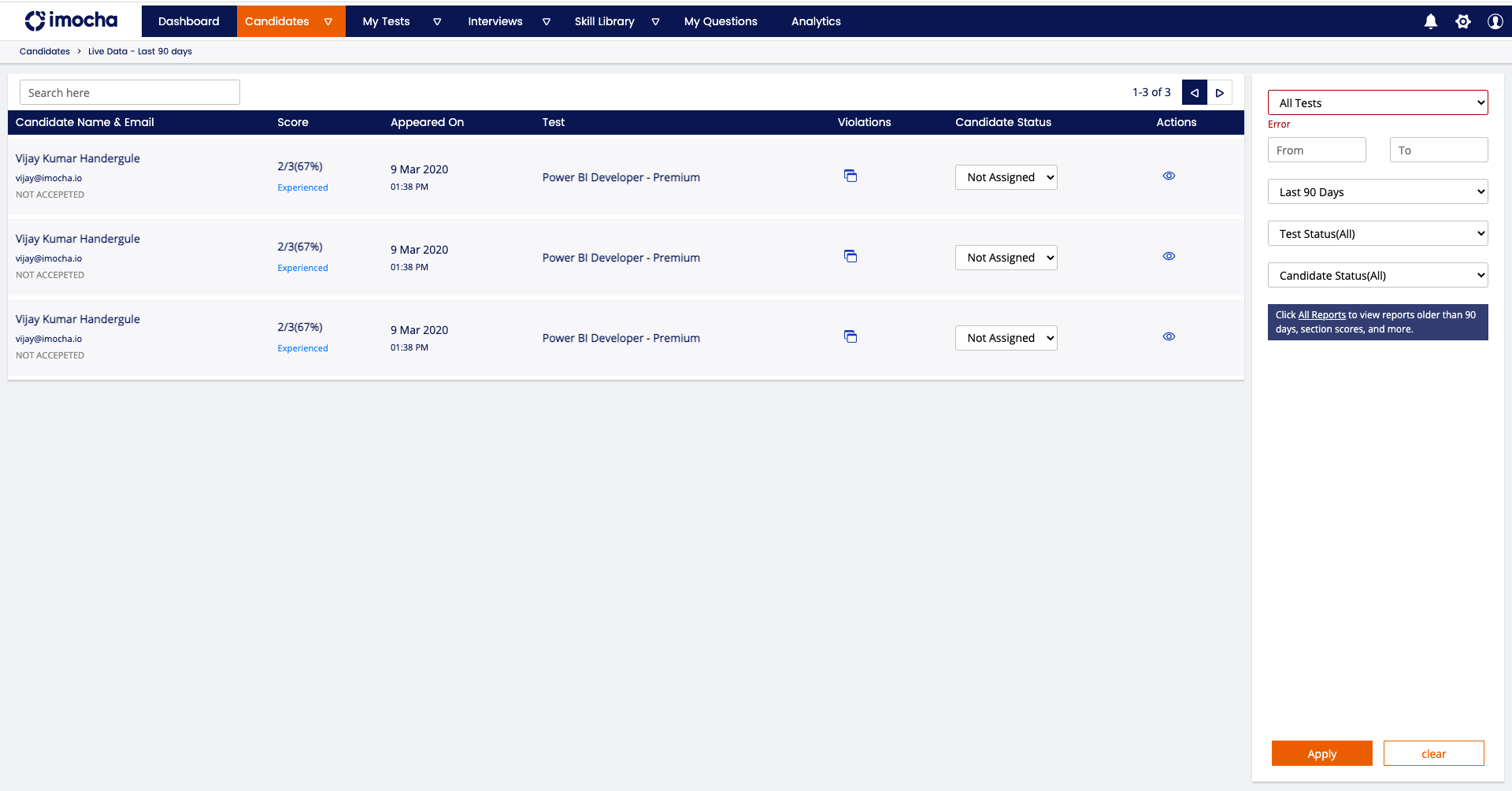
Our previous design language, though warm in nature, lacked consistency. So we're changing that. Now, when you open our app platform, you'd notice iMocha branding consistent with our website, which means the colors will be bright, energetic, and fresh (just like a cup of mocha).
You'll also notice a visible change in readability. Earlier, due to the use of muted colors, we often had issues with readability. So, we decided to get rid of that color scheme, and implemented our new colors in a manner that enhances readability and reduces strain on your eyes.
Here are a couple example snippets from the app that reflect the changes. We, however, encourage you to explore the app and see the changes in action!

 We have also added clear CTAs on the app so you know can navigate through the app better. And what's more? This is scalable on all traditional devices.
In the coming future, you'll also see better navigation, more features that keep your cognitive load to the minimal, and better reporting (reverse funnels, one-glance reports, etc.) as part of our effort to create a design language that has true meaning. You'll be able to see all of these changes on the app platform from September 6, 2021 onwards.
Have more questions about this? Please write to us at marketing@imocha.io.


